No shared language. No shared system.
Walmart Data Ventures ran multiple enterprise products (analytics platforms, merchant tools, internal dashboards) built by separate teams with no shared design foundation. Nobody had declared it a problem yet. I did.
An audit I ran across the full Luminate product suite mapped the gaps: duplicated patterns, inconsistent interactions, components that looked similar but behaved differently depending on which team had built them. Design debt was accumulating faster than any single team could address. I used that audit to make the case for a unified system, and then built it.
Architecture before aesthetics.
Audit and pattern extraction
Catalogued existing components across all products, identifying what was being rebuilt repeatedly, what was inconsistent, and what was genuinely novel. The system was designed around real usage patterns, not hypothetical ones.
Schema-agnostic component architecture
Components were built to accept any data shape without requiring internal changes. Product teams could configure behavior, density, and visualization type through a clean props layer, not by forking the component.
AI-assisted color palette generation
Introduced generative AI tooling to produce accessible, on-brand color palettes for data visualization, a process that previously required weeks of manual iteration between design and accessibility review.
Governance model for adoption
Defined contribution guidelines, review cadence, and documentation standards so the system could evolve without central bottlenecks. Teams could propose, build, and ship new components within a clear framework.
Components built for enterprise density.
DV Components: Walmart Data Ventures
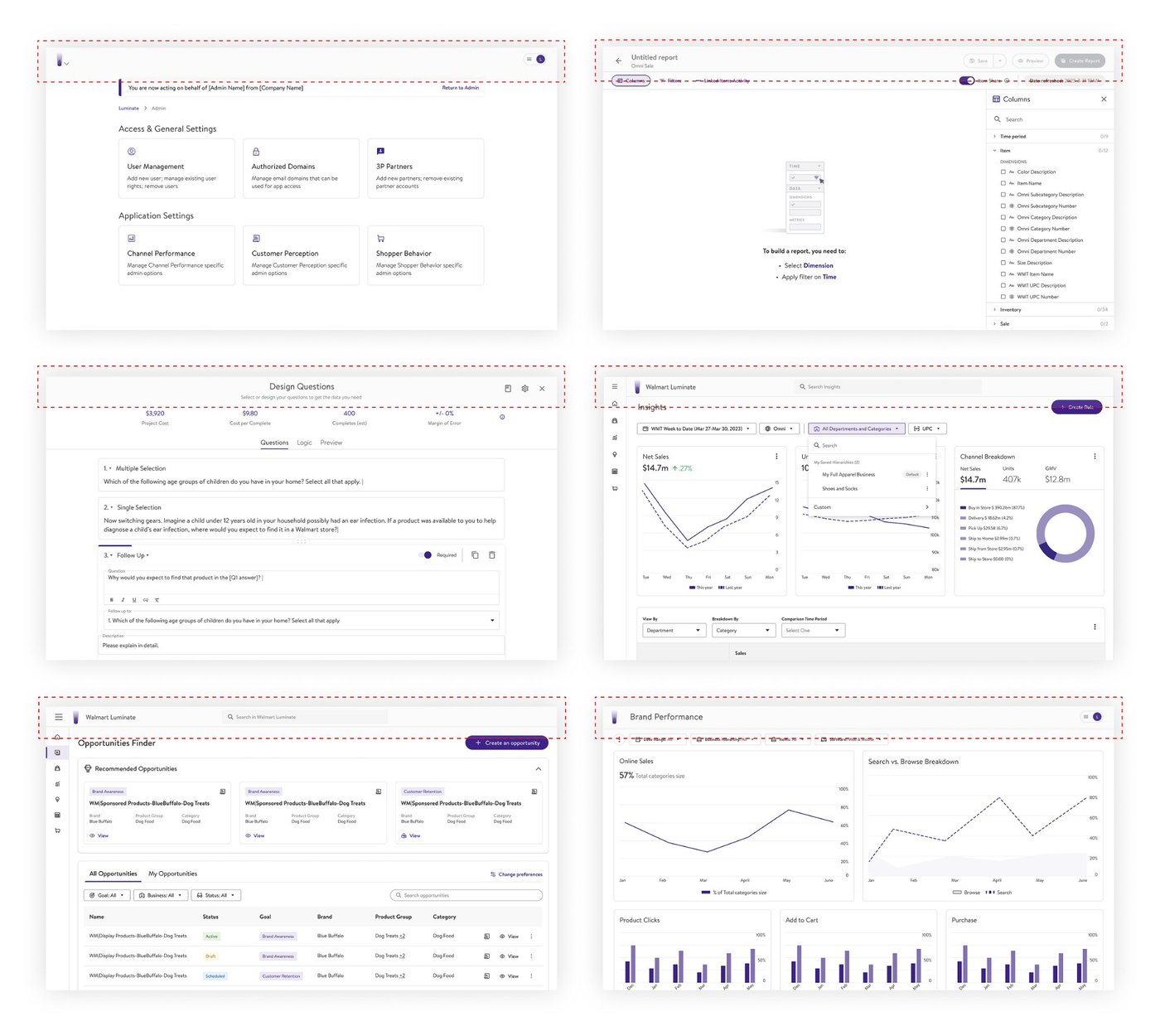
The audit that started it all: inconsistencies mapped across six Luminate products, which became the case for a unified system
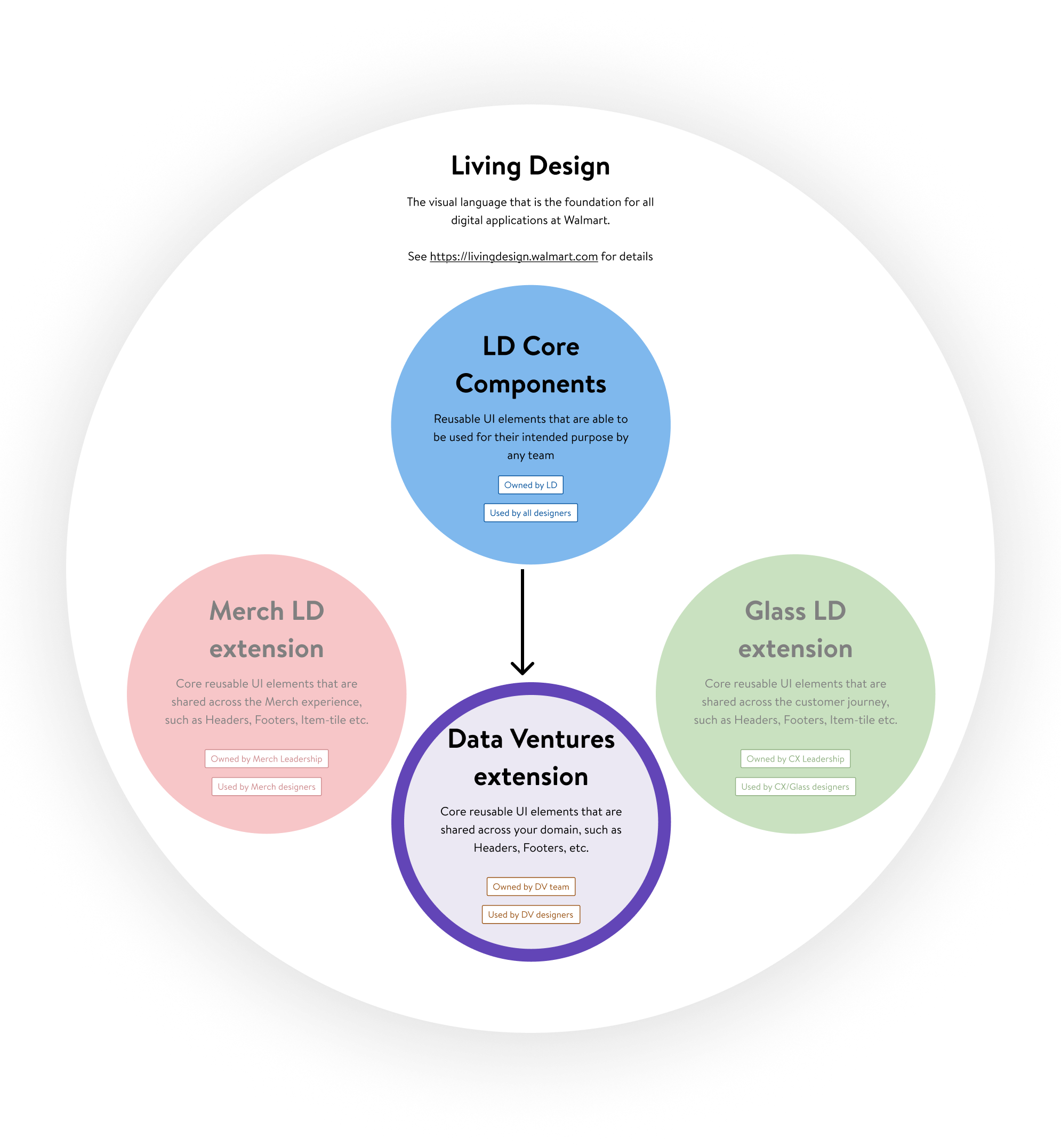
System architecture: DV as an extension of Walmart's Living Design foundation
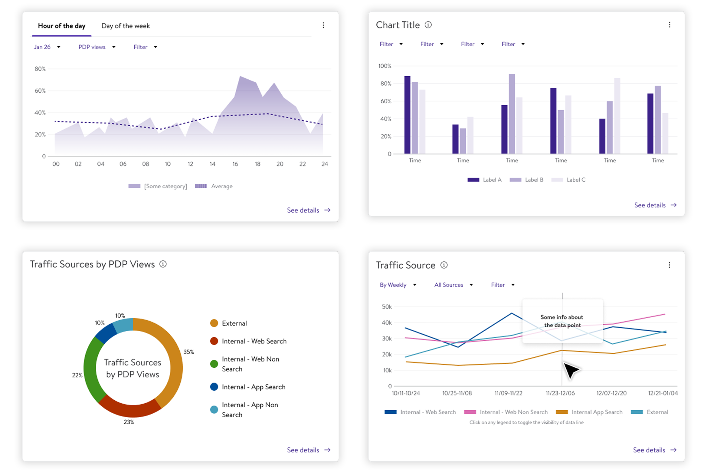
Chart suite: area, bar, donut, and multi-line components in product context
Token architecture: color scale, component variants, and usage guidelines
The Data Table: schema-agnostic, fully configurable, adopted as the standard across all Luminate products
Line Chart component: variants, hover interactivity, mono/color themes, and responsive behaviour documented for engineering handoff
Two decisions that shaped the system.
DV extension over a standalone system
The tempting path was to build a fully independent DV design system from scratch, one we owned entirely, with no dependency on the broader Walmart Living Design foundation. Faster to ship the first version, easier to control.
We chose to build as an extension of LD Core instead. The tradeoff was a more complex architecture and a dependency on another team's roadmap. The return: every future improvement to Living Design automatically benefits DV products, and DV designers stay fluent with the same foundations used across Walmart. A standalone system would have become an island.
Configurable components over product-specific forks
Early in the process, individual product teams had already started building their own versions of common patterns: tables, filters, chart headers. The path of least resistance was to bless those forks and call it a system.
Instead we consolidated them into configurable components with a clean props layer. Product teams could get the exact behavior they needed through configuration, not by copying and modifying. The short-term cost was saying no to some team requests. The long-term gain: zero design debt for every new product that launched on the system, a claim that held through the full 11 months.
Measurable outcomes across the organization.
Heard across the org.
The full story is better told in person.
Component architecture decisions, governance model, token structure, and adoption strategy are available in a private walkthrough.
Request a Walkthrough →